
Covid Statistics
Tools Used:
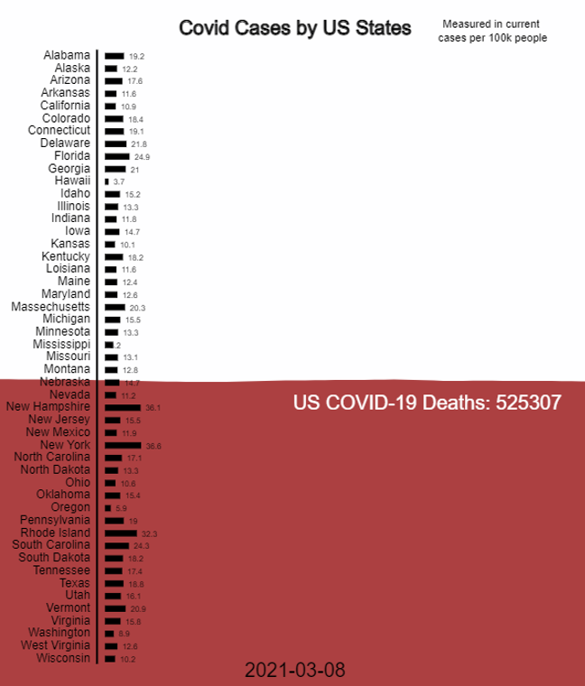
vertical histogram that shows a state’s Covid-19 case on every date since the start of the pandemic. I’m using a free API for Covid statistics through https://apidocs.covidactnow.org, this was great and had good documentation on where to access history of state data and country data for Covid-19.
I had an idea to have a death tally be a pool of blood that rises in the background. To achieve this I found a great piece of p5js code that does a liquid simulation from author YiyunJia. To do this, I added a death tally from the US historical data JSON and raised both the water and death tally text up towards the top the closer it got to the current death toll today.
Conclusion
This piece was a bit intimidating to work with as a first time into doing data visualization through code and only using an API once or twice in the past. I’m happy with the final product, it’s interesting to see how uniformly the pandemic swept through our population despite states deciding on different restrictions. You can see areas around winter going up and spiking Covid was at the center of our minds for years and this piece gave a little bit of closure from that period. I wish I had started this assignment sooner, but I’m happy to be done with it now, it was a good experience.